

OUR WORK
See how our insight driven messages and content drive awareness, conversion and loyalty.
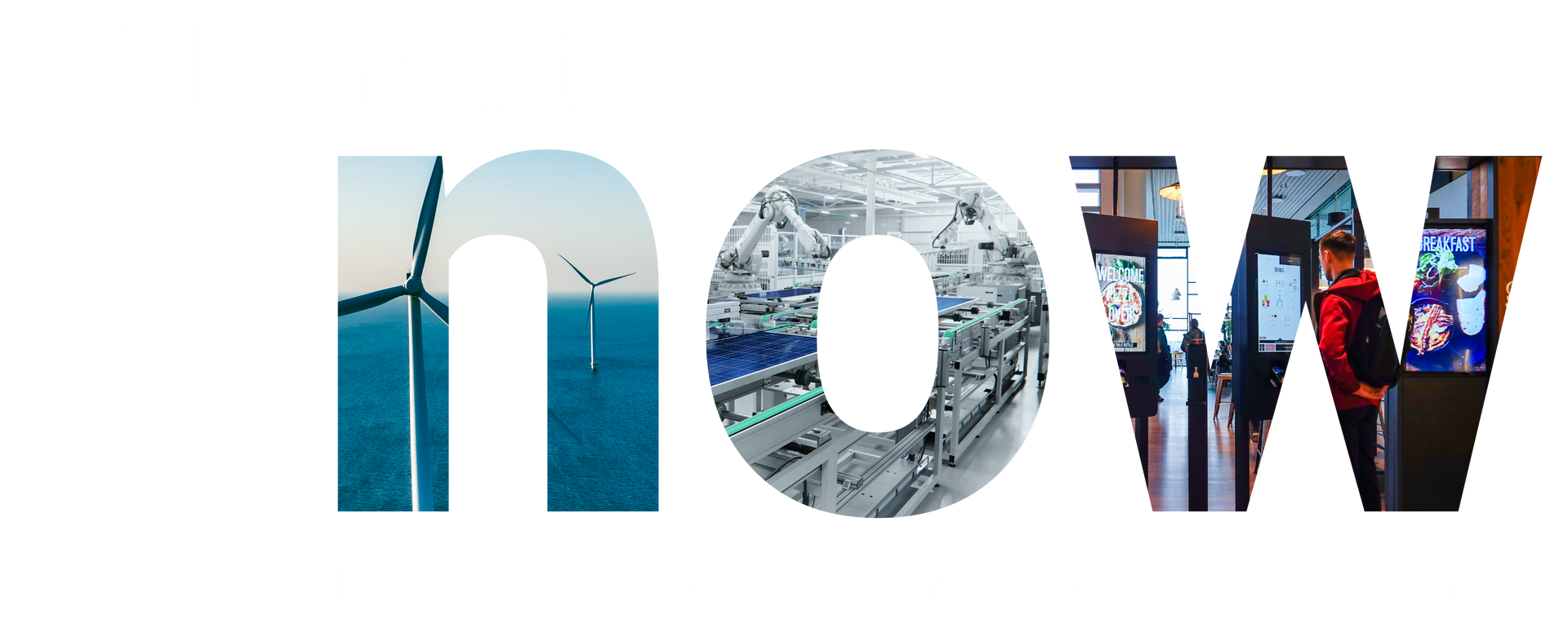
Dell Technologies
See how our work with Dell has helped to evolve their 25-year legacy into something inspiring and forward-thinking. Our brand marketing work enables the OEM division of Dell to connect with business and customers on a more emotive level.
DELL CASE STUDY
True Measure
When Wellness Consolidated came to us with a rebrand they came with a new name: True Measure. Our job? Create an entirely new brand around the idea that the truest measure of an
organization is its people. How happy they are. How engaged they are. How
healthy they are. These are the most important measurements of all. Because
when employees feel positive about themselves and their work, everyone
succeeds together.
TRUE MEASURE CASE STUDY
Sound Transit
Come meet Boop, your friendly and approachable ORCA payment card companion, always eager to help transit riders get to their destinations safely, on time and in the simplest way possible
SOUND TRANSIT CASE STUDY
Whidbey Telecom MultiGiG
See how we helped Whidbey Telecom launch a multi-gigabit fiber internet service aimed at gamers, content creators, family fun leaders, and work-from-homers.

LogRhythm
Discover how Speak! reimagined LogRhythm's brand, elevating their global presence and engagement with a compelling brand story and fresh visual identity.
LOGRHYTHM CASE STUDY
180one
Speak Agency rebranded 180one, an executive placement firm, emphasizing a message-first approach. The project, capturing 180one's approachable yet professional essence, introduced a new brand strategy, messaging, and visual identity, under the tagline "Higher Level Hiring."
Tradeshift
See how the Speak! team built a comprehensive marketing toolset by activating reinvigorated brand typography, graphics, and photography for a growing international trade network business.
TRADESHIFT CASE STUDY
Whidbey Telecom
Every business has a story to tell, you just have to find it. That was the case with a beloved regional telecom provider on Whidbey Island. In our brand discovery process we learned that people who live on Whidbey Island do so to enjoy everything the island has to offer — art, culture, outdoors, beaches — without worrying about technology. View the case study to see how we used this valuable insight to set them apart from their national competitors.
WHIDBEY TELECOM CASE STUDY
ProKarma
Our goal — change the market's perception of ProKarma from meh to va-voom by merging strong positioning and messaging with a vibrant visual identity. Going big out of the gates, our discovery process included a brand workshop with 120+ sales employees at the company's annual sales meeting. View the case study to see what happened next.
PROKARMA CASE STUDY
Apruve
See how we helped a fast-growing FinTech understand their newly expanding executive audience. With clear positioning, meaningful messaging and a visual identity to appeal to a sophisticated audience, our work helped this SMB grow to the next level.
APRUVE CASE STUDY

EIS
When a cutting-edge InsurTech asked us to craft a compelling integrated campaign that cut through the noise, we delivered — compelling property and casualty insurers to see things differently.
EIS CASE STUDY
Prysm
A lead generation imperative. We helped Prysm develop a content marketing program to support their new position in a hotly contested market. Our understanding of their target personas and buyers journey forged the foundation of a provocative inbound marketing program that attracted, informed and delighted audiences.
PRYSM CASE STUDY
Clients, Collaborators, Friends
We would love your logo here.
