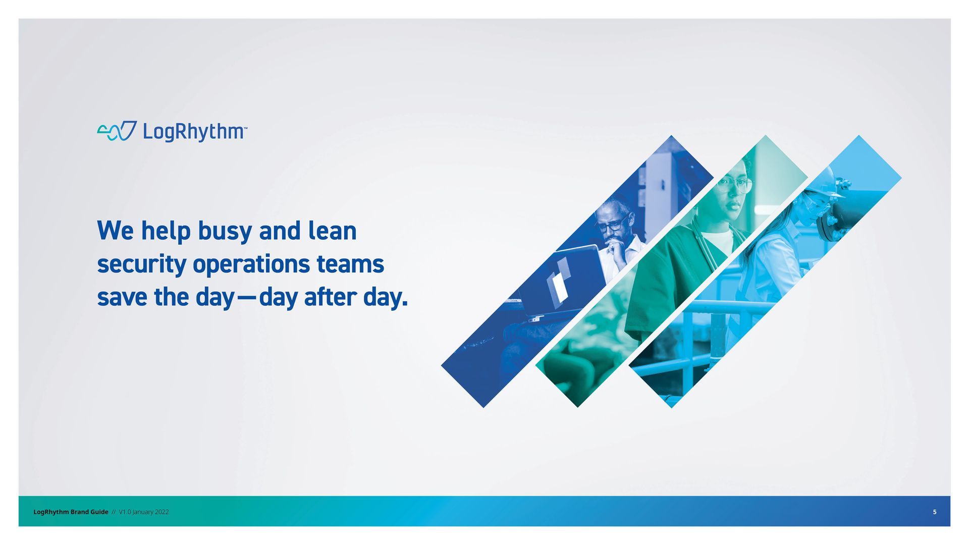
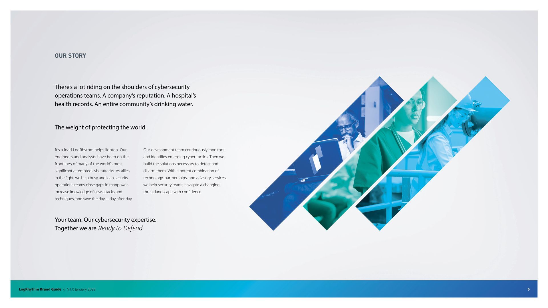
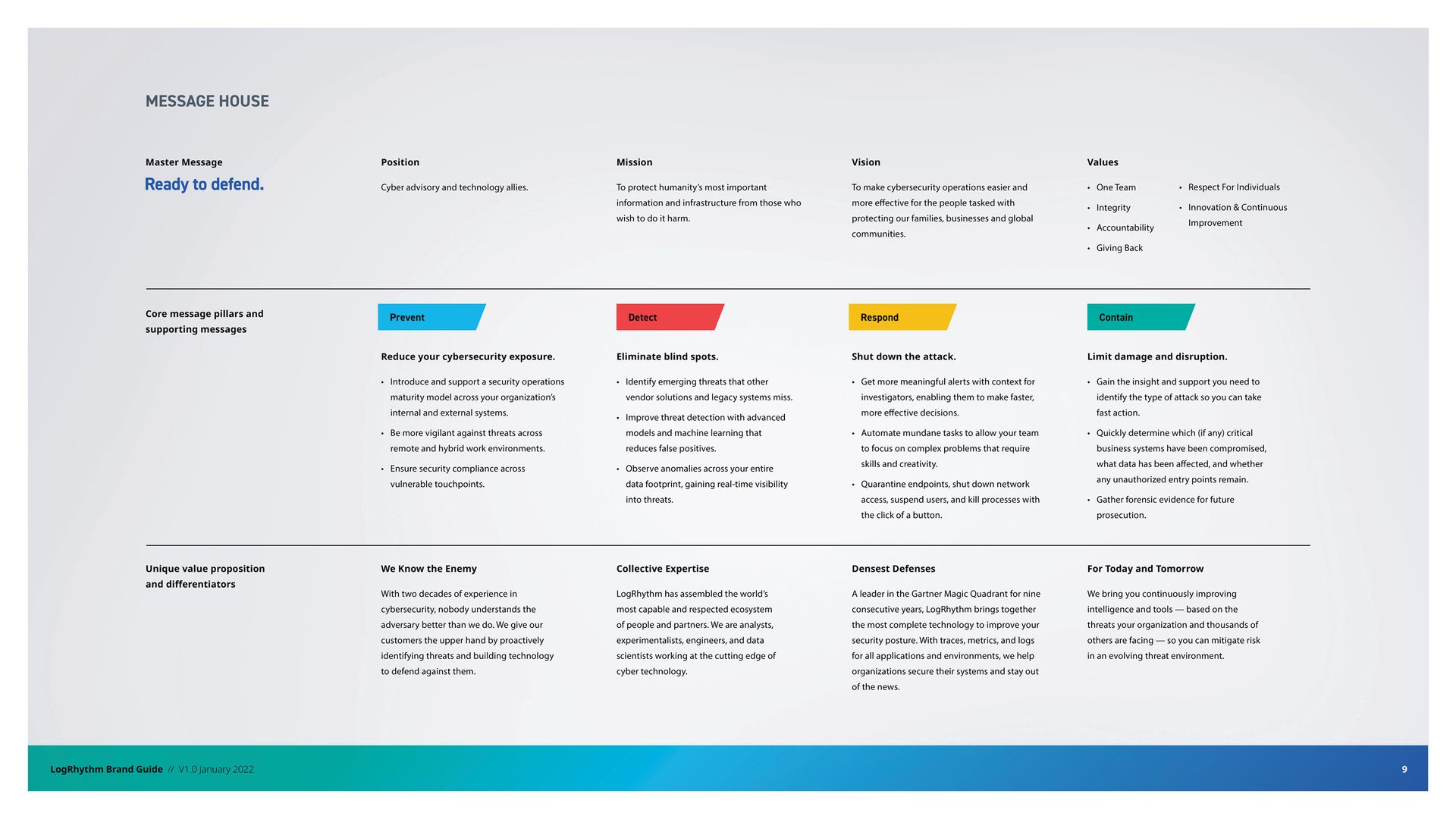
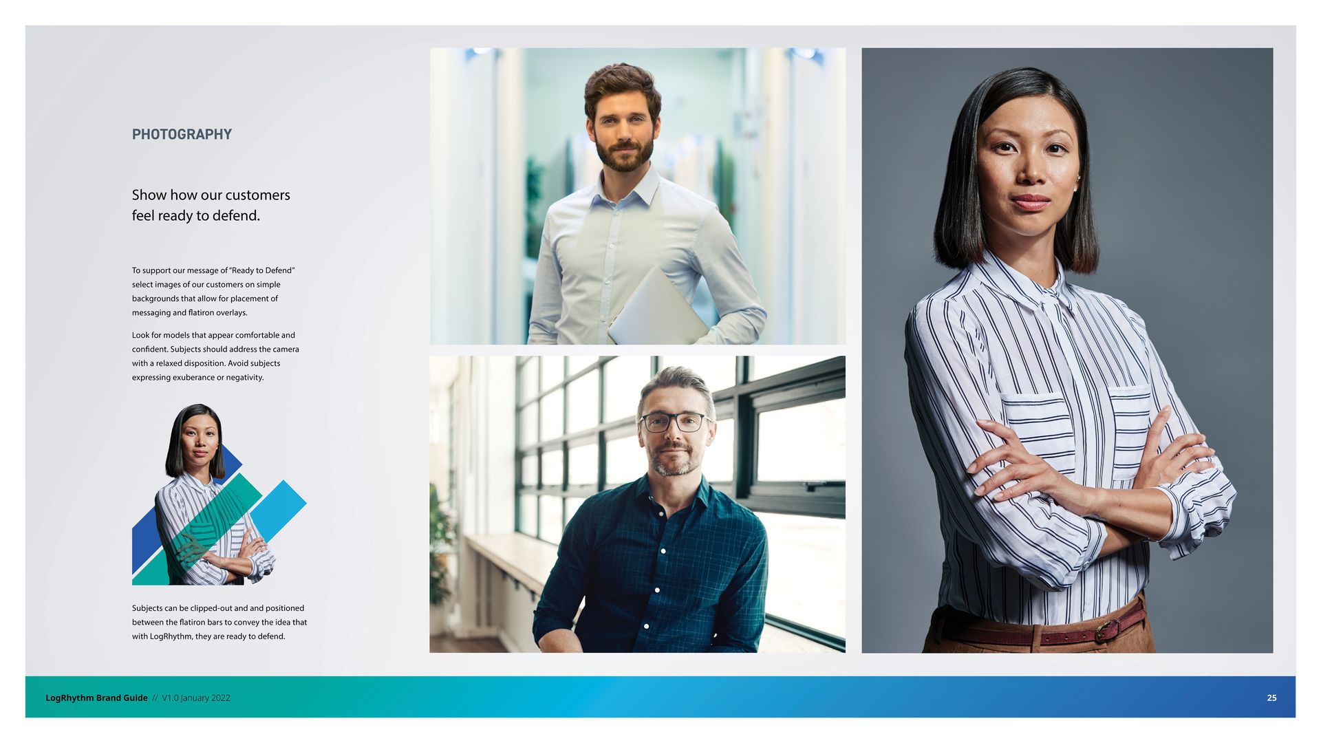
Ready to defend.
Reimagining a LEADING Cybersecurity software brand for the future
PROJECT SCOPE


What They Were Up Against:
LogRhythm was an early entrant in the cybersecurity category. But as the company transformed itself into a SaaS-based SIEM platform provider — and as new competitors circled — it became clear that a brand rethink was required.
While industry analysts recognized LogRhythm’s offering as innovative, the LogRhythm brand hadn’t evolved to meet the moment. The company needed a bold, new brand positioning and identity to communicate its evolution—and to immediately stand out in a crowded cloud security market.
Core to our work was shaping the LogRhythm brand to inspire hard-to-reach Chief Security Officers (CSOs) and Chief Information Security Officers (CISOs).
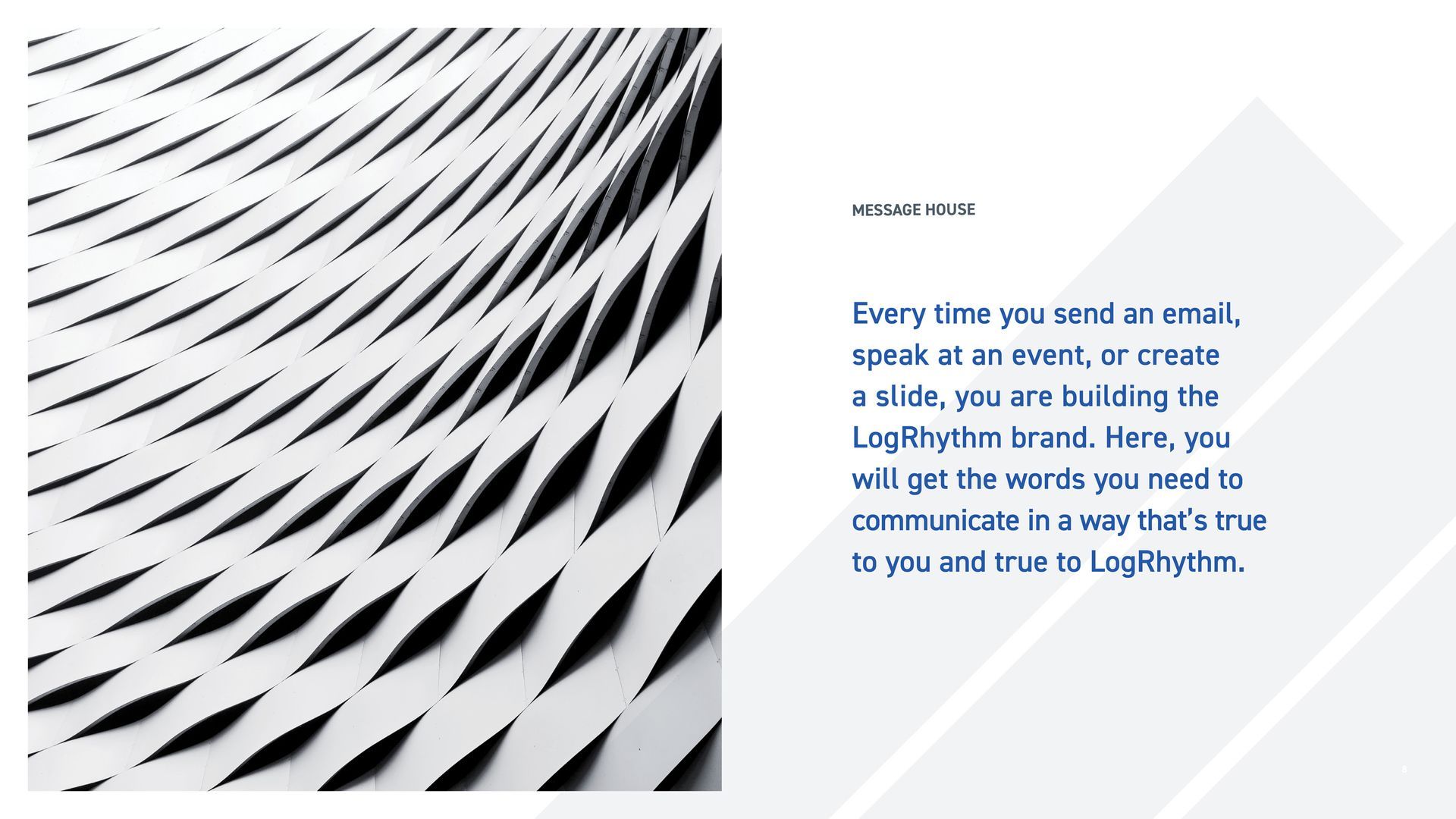
Brand Narrative
Speak! conducted a series of stakeholder discovery sessions including an interactive brand workshop. A unique thread emerged. From the executive team to the call center, everyone at LogRhythm holds its customers in the highest esteem. Cybersecurity is a stressful, high-stakes gig where a single data breach can bring a Fortune 500 company to its knees. When called upon, the LogRhythm team will roll-up its sleeves and work shoulder-to-shoulder with customers to answer the call.
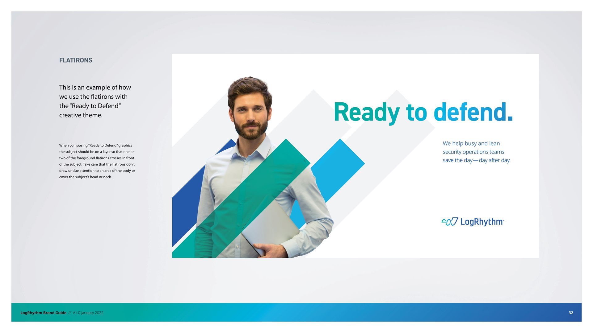
Speak! tapped into this reality and positioned LogRhythm as an ally in the fight. Building the narrative around the motto “Ready to Defend,” we positioned the brand as a vital and confidence-inspiring partner for busy, lean cybersecurity teams.
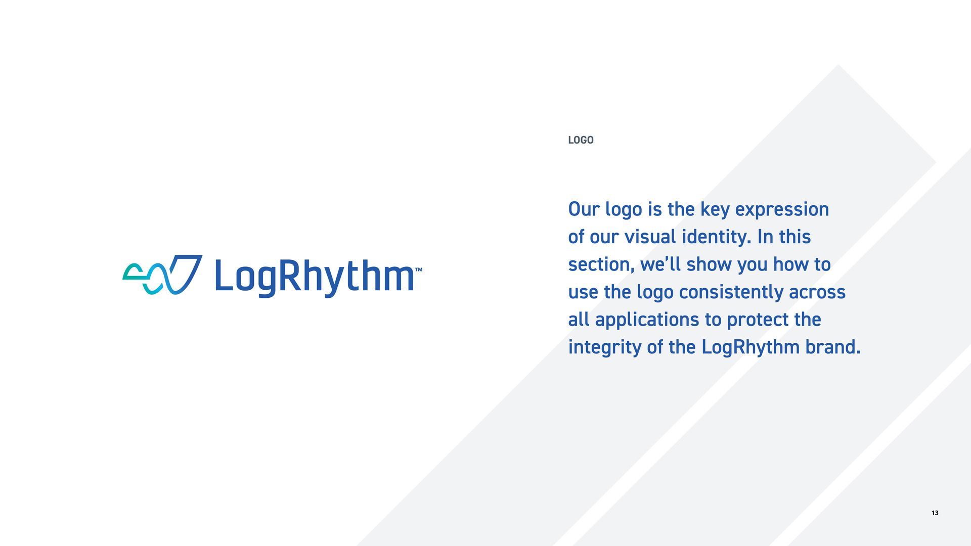
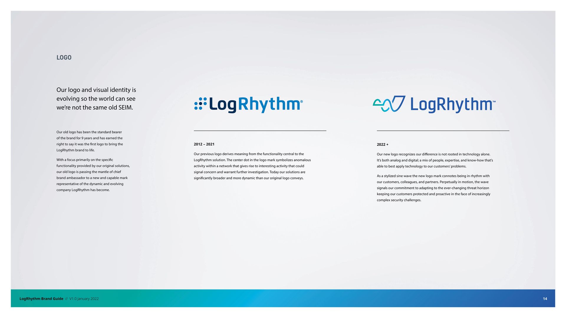
Logo
The previous logo derived meaning from the functionality central to the LogRhythm solution. The center dot in the logo mark symbolized anomalous activity within a network that gives rise to interesting activity that could signal concern and warrant further investigation. Today LogRhythm solutions are significantly broader and more dynamic than the original logo conveys.
Speak developed a new logo that recognizes the LogRhythm difference is not rooted in technology alone. It’s both analog and digital; a mix of people, expertise, and know-how that’s able to best apply technology to our customers’ problems.
As a stylized sine wave the new logo mark connotes being in rhythm with our customers, colleagues, and partners. Perpetually in motion, the wave signals our commitment to adapting to the ever-changing threat horizon keeping our customers protected and proactive in the face of increasingly complex security challenges.
Visual Identity
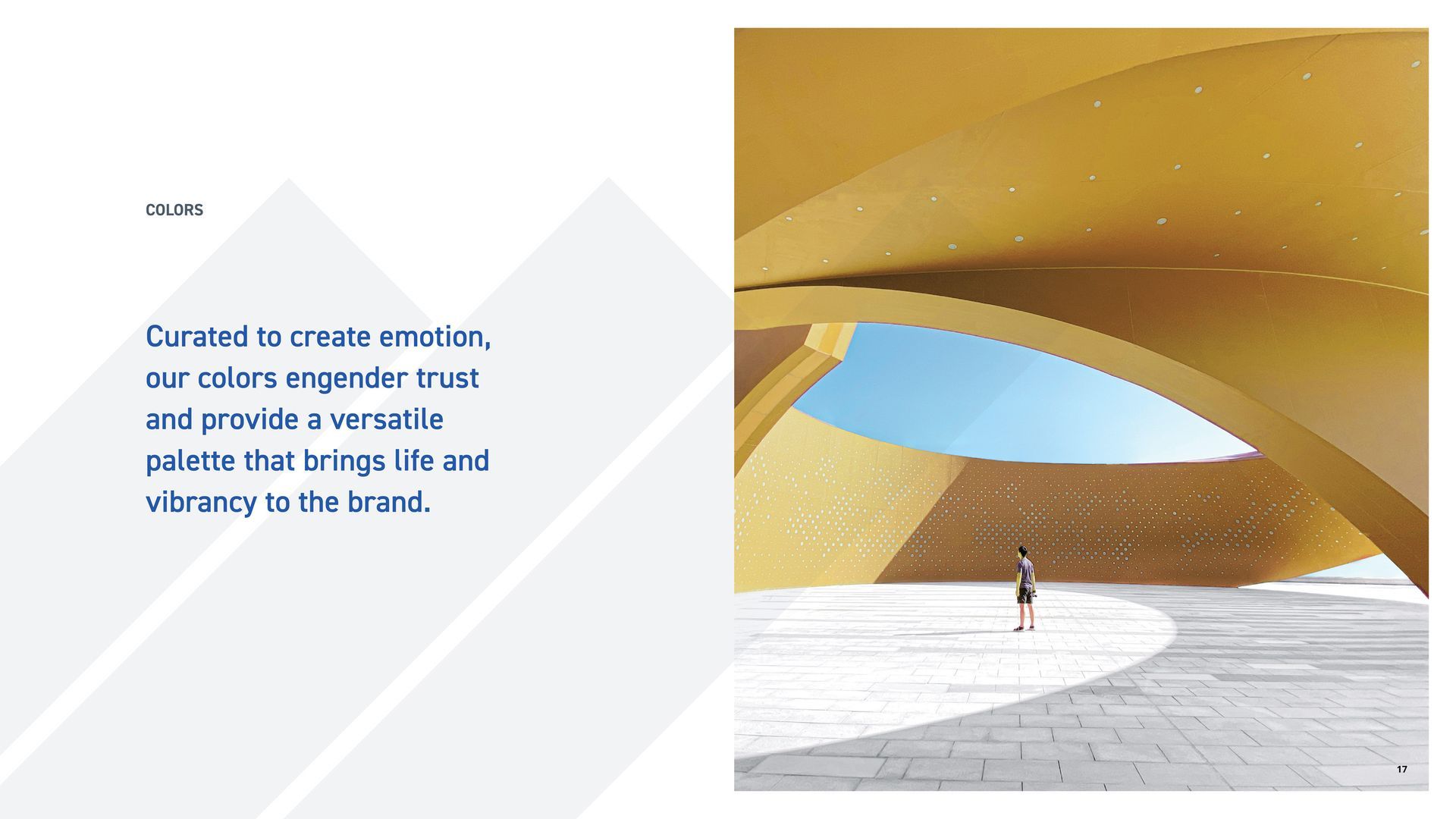
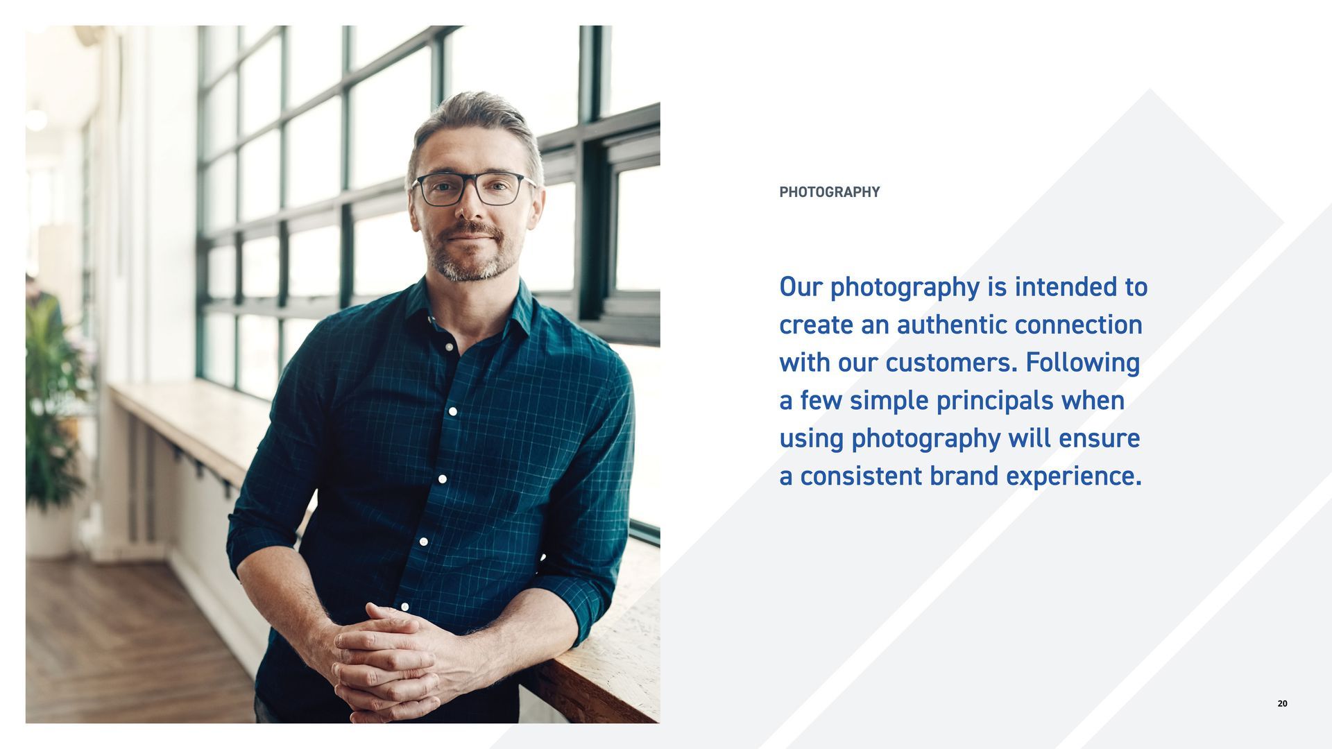
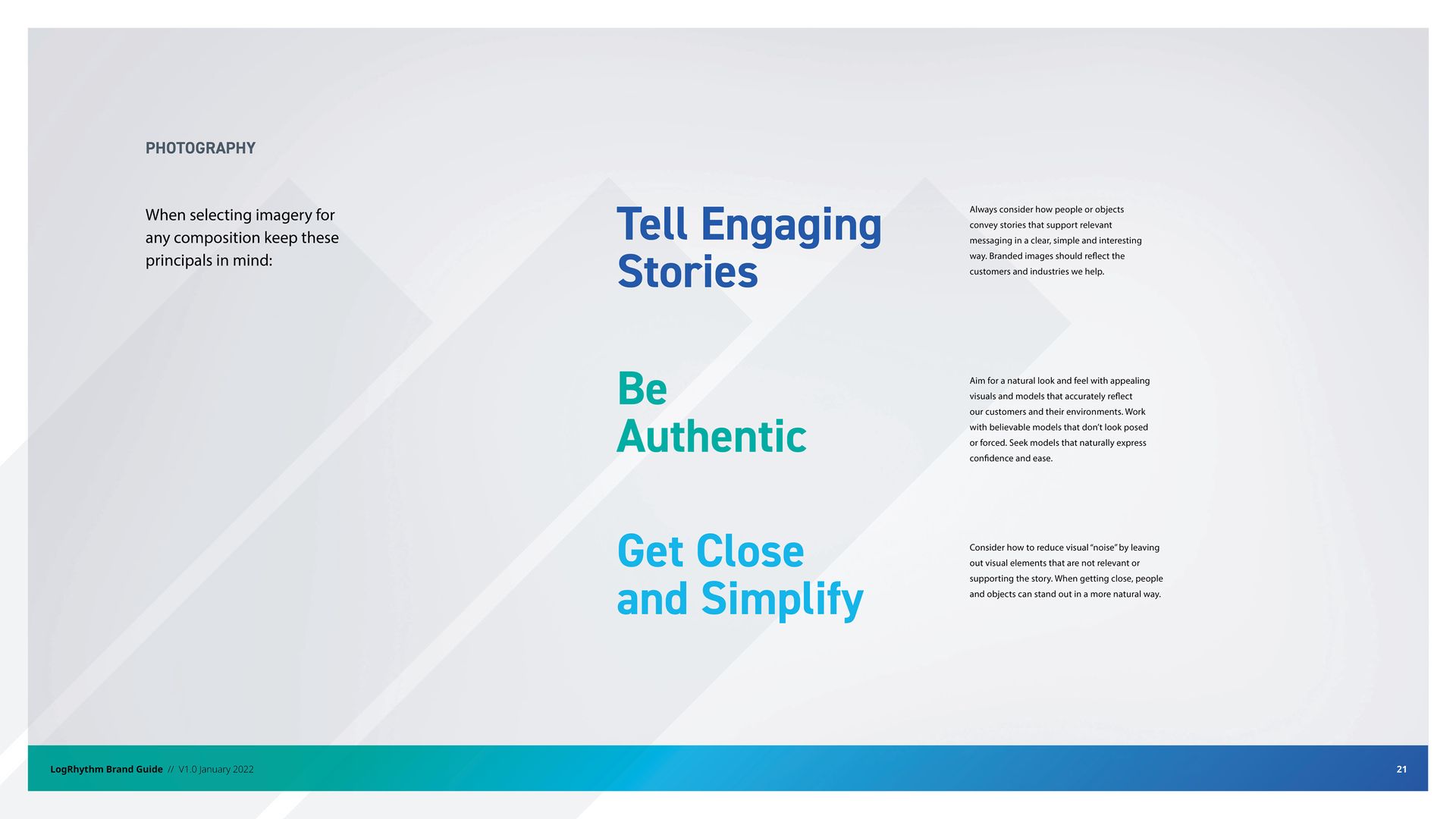
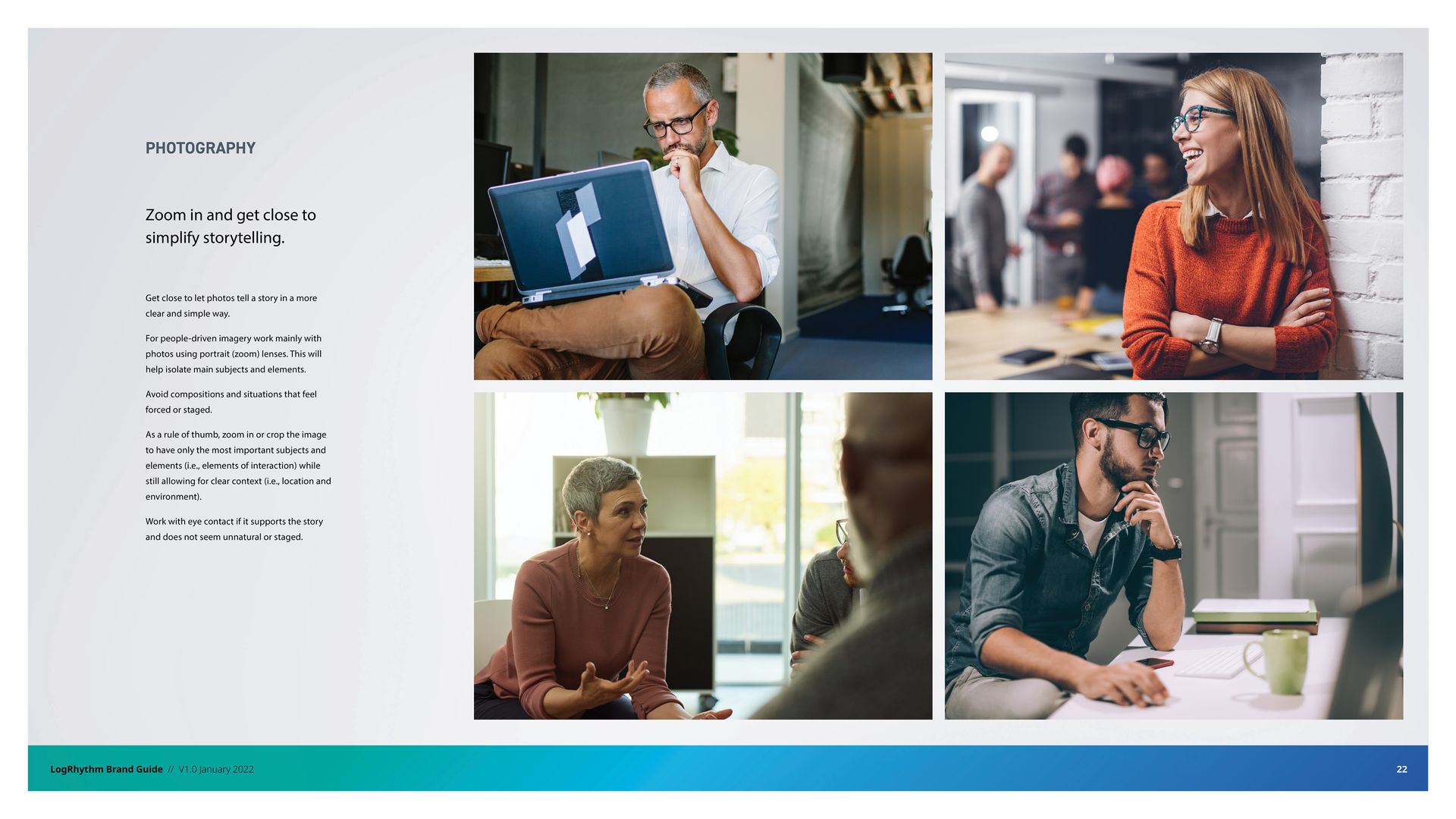
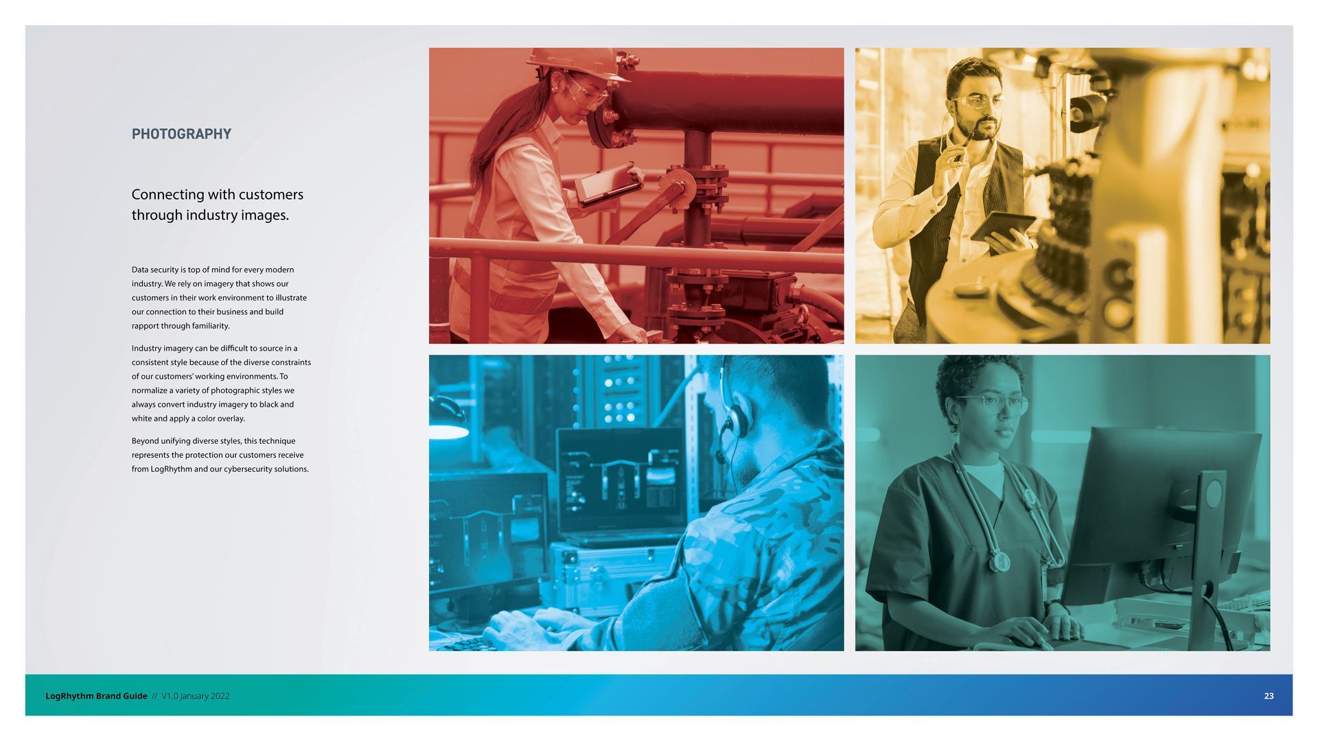
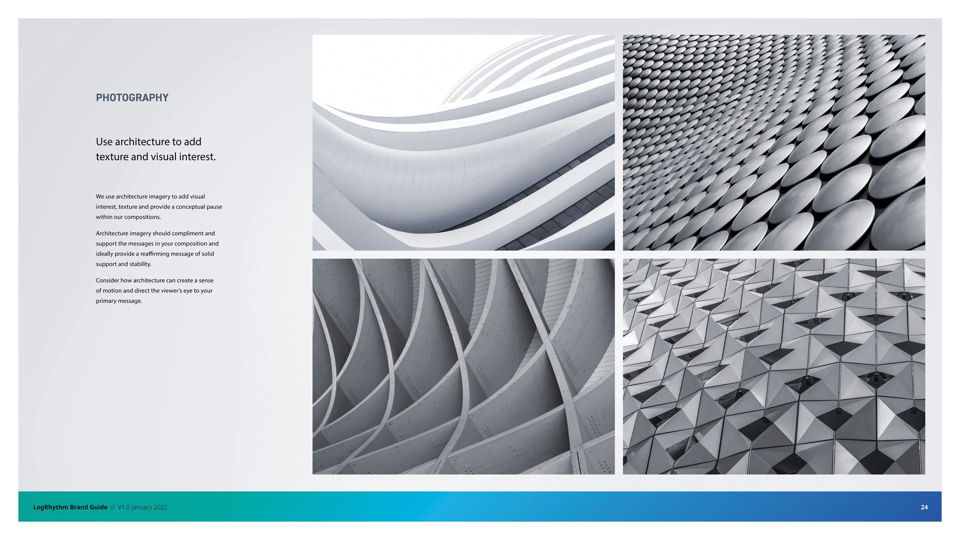
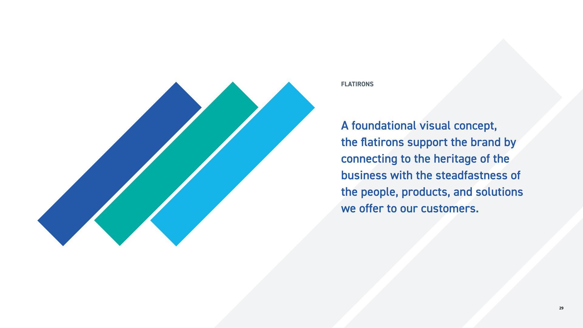
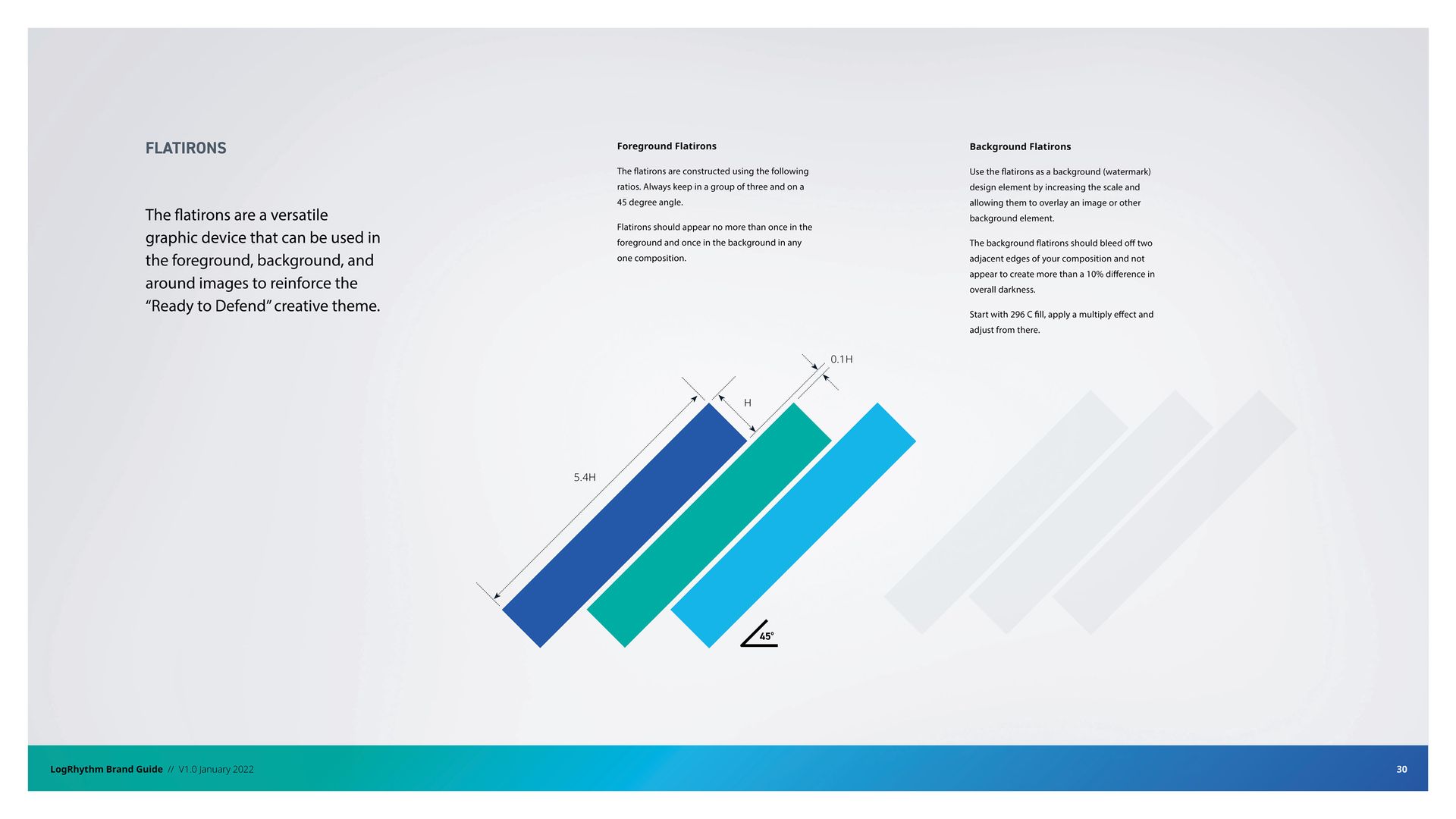
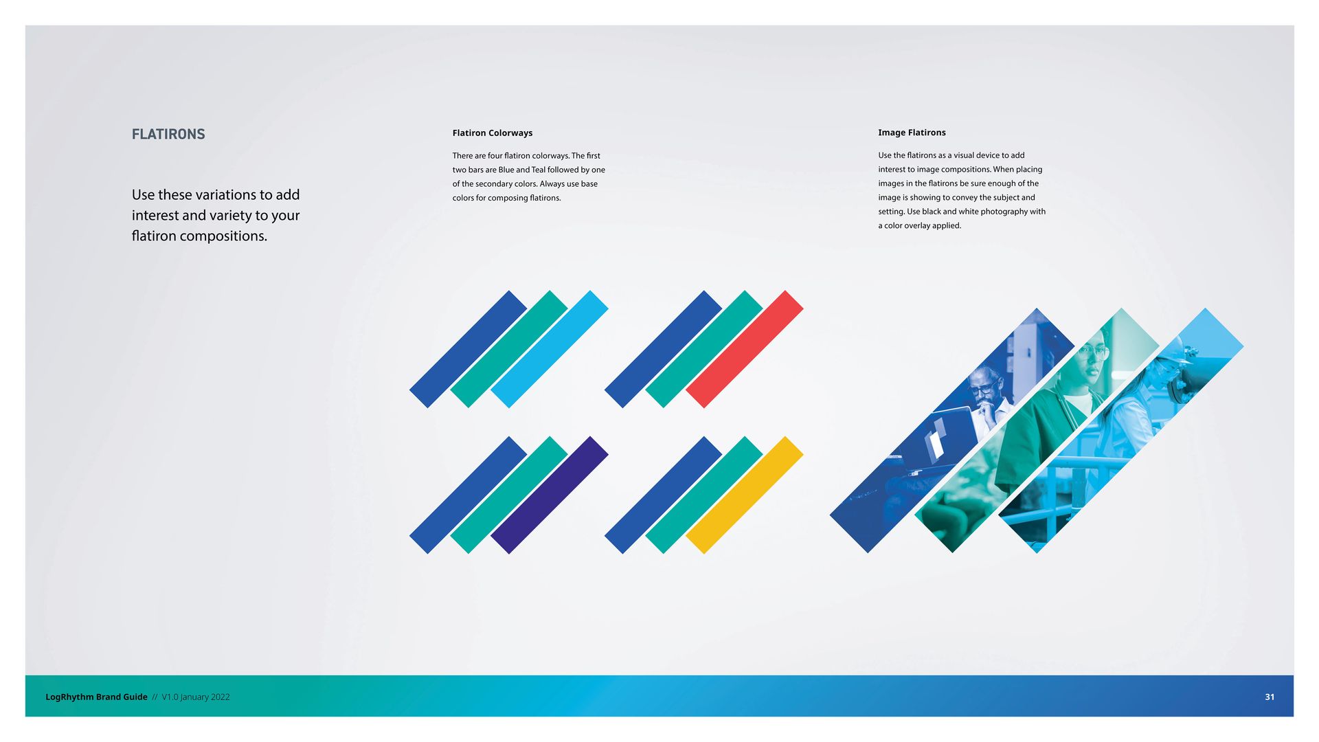
In an industry marked by dark, nefarious-feeling imagery, there was a clear opportunity to differentiate visually. Speak! tapped into a more hopeful, humanistic tone. A vibrant gradient, tech-forward typography, people-enabled photography and a graphic language of Colorado Flatirons inspired “protective” bars gave the brand a distinct look and feel.
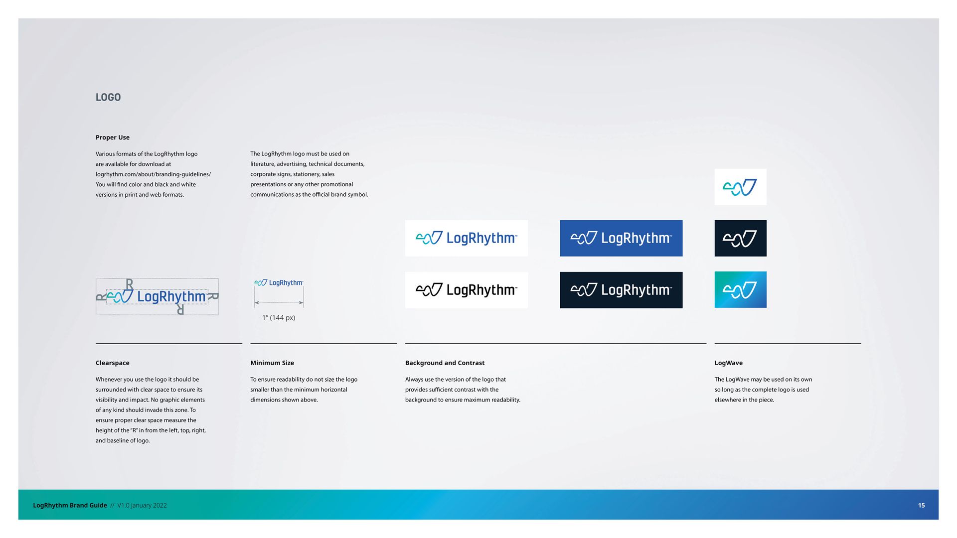
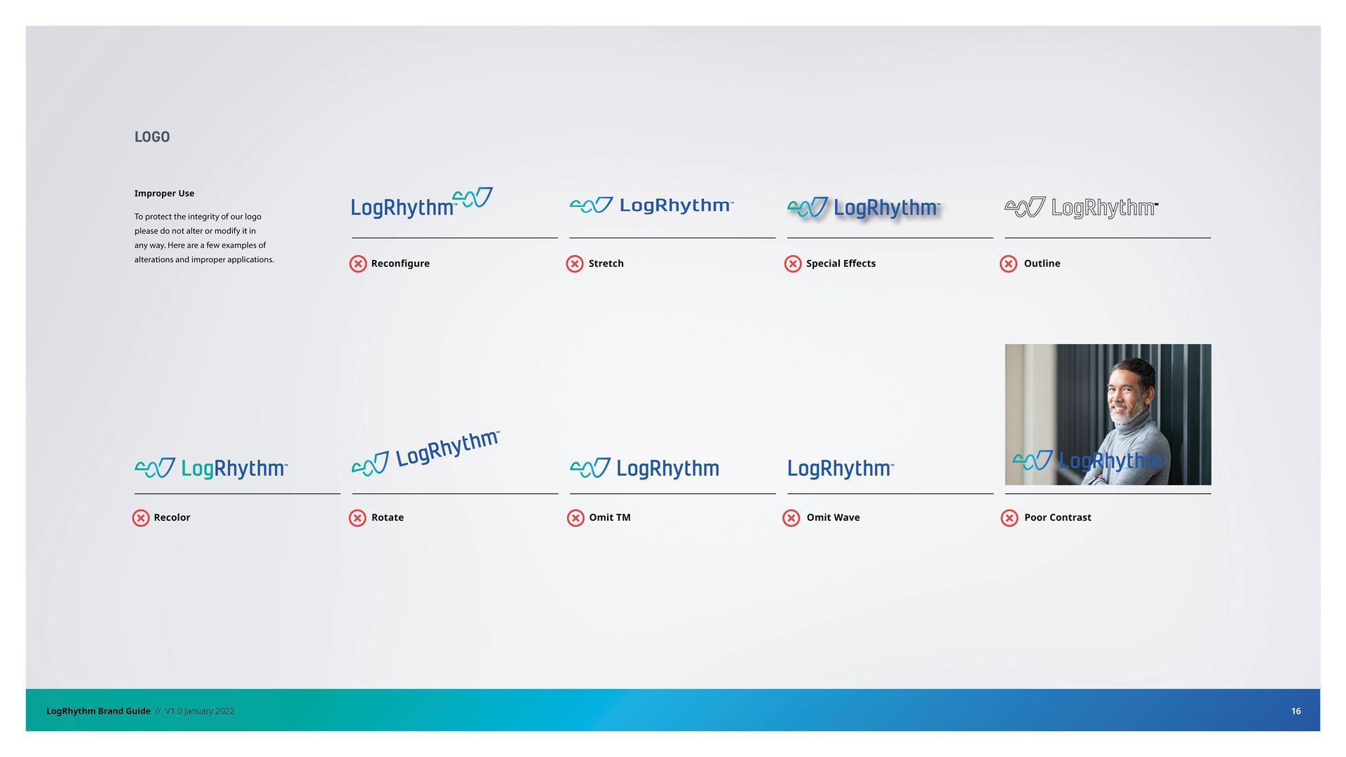
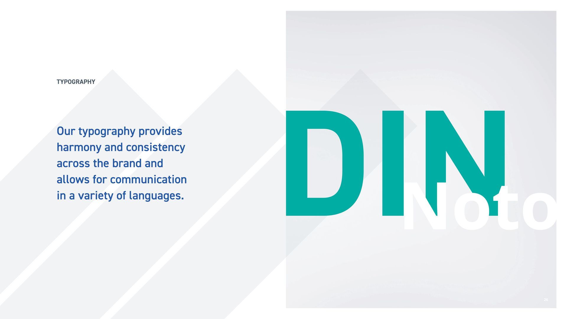
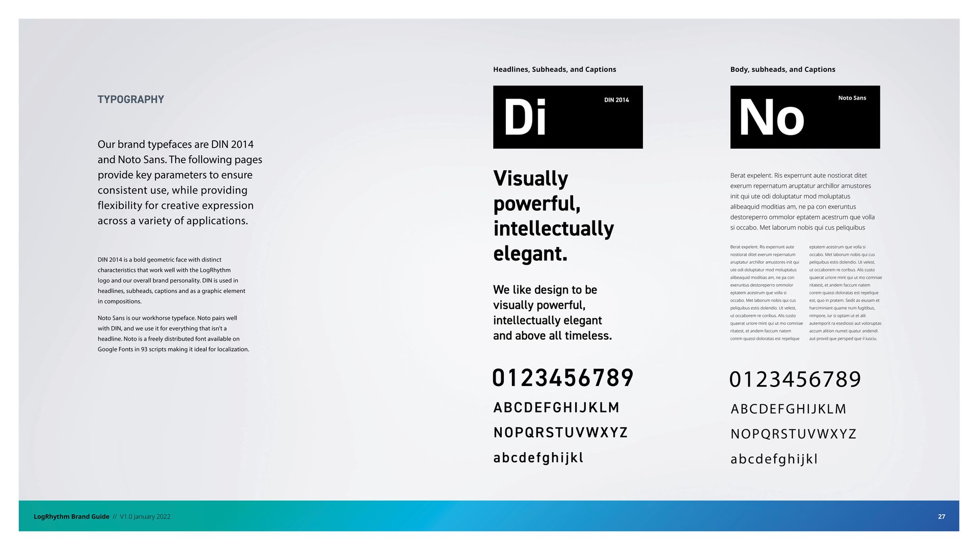
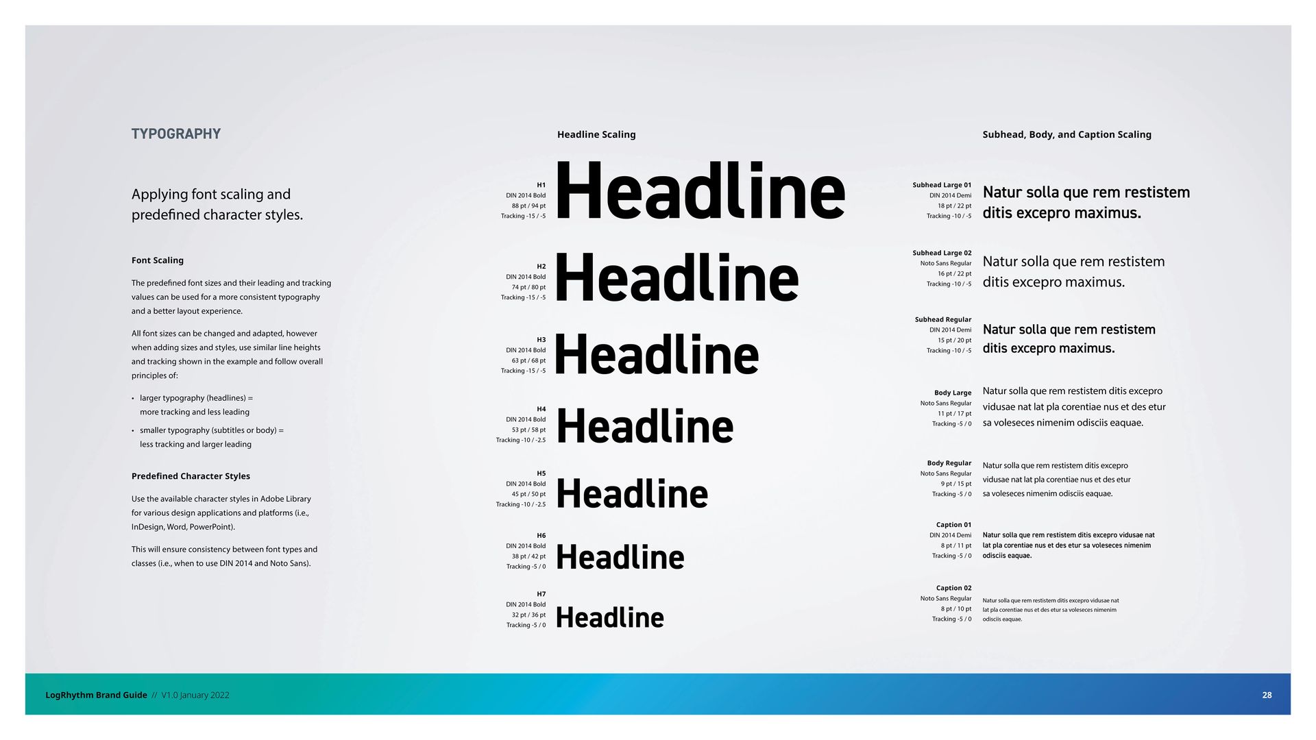
Speak! crafted a brand book to establish consistent branding guidelines for LogRhythm. The guidelines define proper logo usage, primary and secondary colors, typography, messaging, and other core brand elements for marketing assets and content.